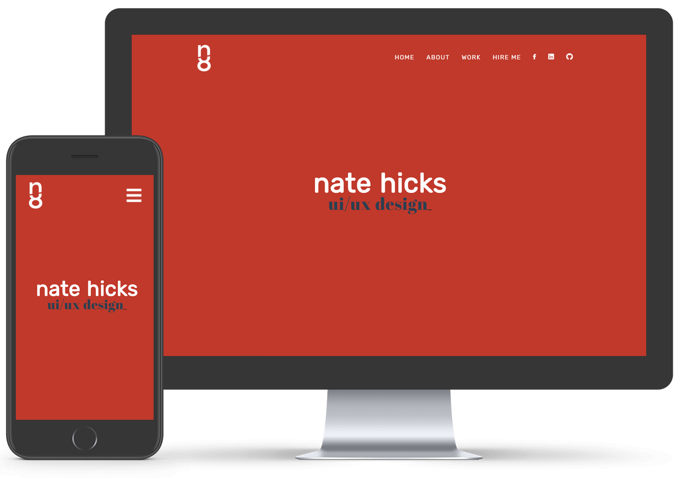
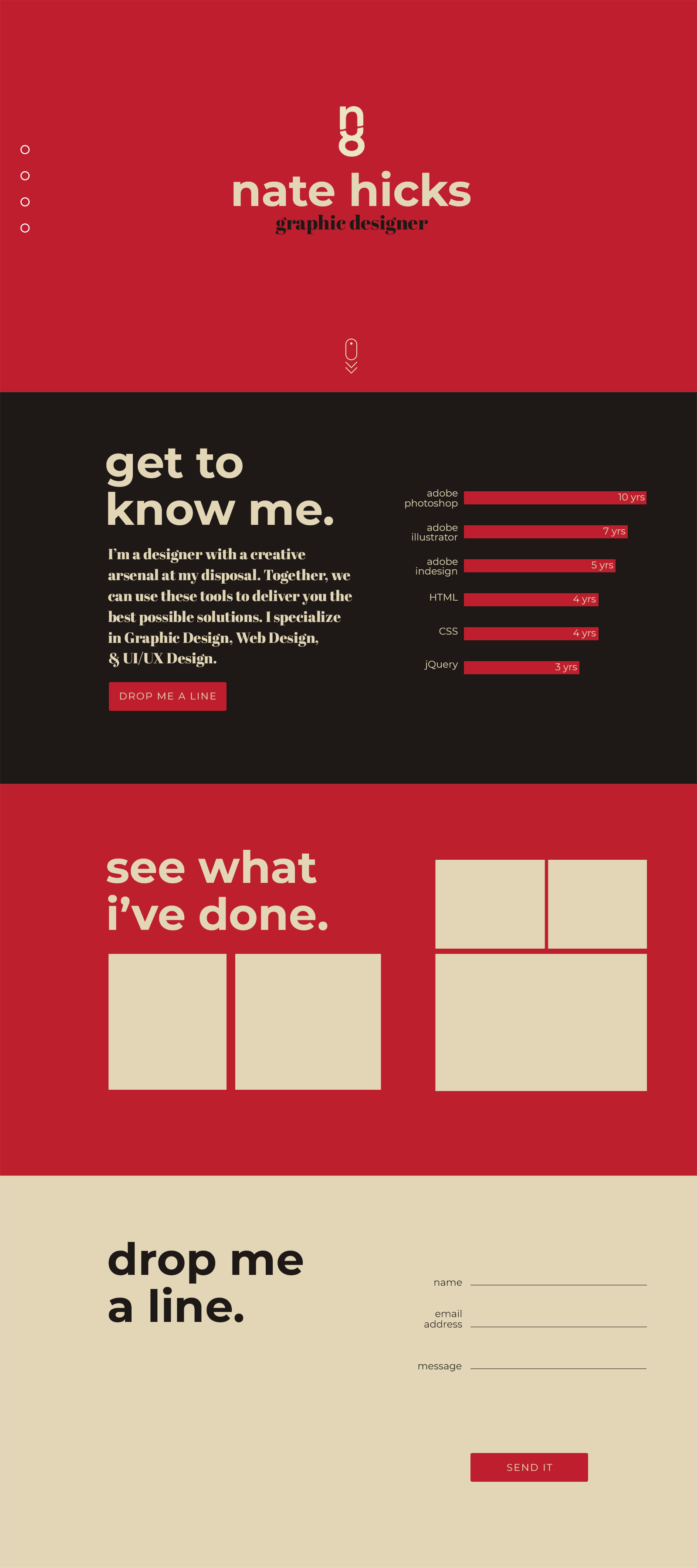
After getting more exposure to the UI/UX and Web Design world, I decided it was time to overhaul my personal identity and clean up my portfolio site. I knew I wanted to build the site from scratch, as opposed to my previous site that I built using a Bootstrap template. I also knew that I wanted to make it more minimal and type focused than my last site with some subtle UI animation. With that in mind, I incorporated Materialize and GSAP.
MOCKUPS & PROTOYPING
My original mockup and prototype were very minimalistic and muted. I wound up using a few UI specific color pallettes for the final run to draw the eye a bit more. I also gave the layout a little less white space to keep the site from feeling empty.
skills used:
mouse
Graphic Design
After some sketching and ideation, I created a new logo and started laying out a cleaner typography focused design system.
code
Web Design
Using Google Materialize, I started laying out a clean and solid website to showcase my portfolio.
phone_iphone
UI Design
To align with the new direction, I chose a rich UI focused color pallette and leveraged my skills with GSAP to incorporate some subtle animation throughout the site.